Software Products Are Systems of Experience
A user's opinion of a product is formed as much by a slow search, a confusing permission error or a late email as by anything drawn in a design file.
Picture a general, and probably familiar, situation. Someone forgets their password and requests a reset. The screen they see is well designed: clear message, good typography, reassuring copy. The email arrives eleven minutes later, by which time they have requested it three more times, and only the most recent link works. They conclude, reasonably, that the product is broken.
Nothing on the screen was wrong. The problem lived in a mail queue, a rate limiter and a token policy that invalidated earlier links. But the user does not see components. They see one product, and it failed them.
That gap, between how products are designed and how they are experienced, is where a great deal of dissatisfaction originates. Design work tends to focus on what can be drawn. Users experience everything else as well.
The interface is a window, not the product
It is natural to think of the interface as the product, because it is the part people see and the part most easily discussed. Designers produce screens, stakeholders review screens, and users are tested on screens.
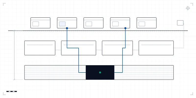
But an interface is a window onto a system. Behind it sit workflows that decide what happens in what order, services that apply business rules, data stores that hold what the product knows, integrations with other systems, and background processes that send messages, generate documents and reconcile records. Every one of these shapes the experience. A beautifully designed search page is a poor experience if the search takes six seconds or returns stale results. An elegant approval screen is a poor experience if the approver is never notified that something is waiting.
Most bad experiences are not visual
When users describe what frustrates them about software, they rarely mention layout or colour. They describe waiting. They describe not knowing whether something worked. They describe being told they cannot do something without being told why. They describe finding that the numbers in one screen do not match the numbers in another.
Each of these has its root below the interface. Waiting is a performance problem. Uncertainty is a feedback problem, often because the backend does not report progress in a way the interface can show. Unexplained refusals are permission problems. Mismatched numbers are data problems: two parts of the system computing the same figure differently, or at different times.
This suggests a practical habit for product teams: when reviewing a design, ask what each screen depends on. Where does this data come from, and how fresh is it? What happens if that service is slow? What does the user see if they are not allowed to do this? The answers frequently change the design, and occasionally change the architecture.
Users rarely complain about layout. They complain about waiting, about not knowing whether something worked, and about numbers that disagree.
Errors deserve as much design as success
Most product design concentrates on the path where everything goes right. That path matters, but for many users on many days it is not the one they take. Their network drops. Their session expires. They enter something the system does not expect. A dependency is briefly unavailable.
Products that handle these moments well share a few characteristics, most of which are decided long before launch (we look at that longer view separately). They say clearly what happened, in the user's terms rather than the system's. They preserve the user's work, so that a failed submission does not mean retyping a long form. They tell the user what to do next, or that nothing is needed because the system will retry. And they distinguish between problems the user can fix and problems they cannot.
None of that is possible unless the backend reports errors in a structured way the interface can interpret. An API that returns a generic failure for every problem forces the interface to show a generic message. Error design is therefore a joint responsibility of the people who build the interface and the people who build the services behind it.
An API is also a user experience
APIs are often thought of as internal plumbing, but they shape the product in two ways. For developers who integrate with a product, the API is the experience: its clarity, consistency and documentation determine whether integration takes an afternoon or a month.
Less obviously, APIs constrain what the interface can do. If an API can only return a complete result, the interface cannot show partial progress. If it cannot say which field failed validation, the interface cannot highlight it. If it offers no way to fetch a summary without fetching everything, the interface will be slow on large accounts. Many product limitations that look like design choices are in fact API choices made earlier, by people who were not thinking about the screen.
Permissions shape what the product feels like
For any product used by teams or organisations, the permission model has a large and underappreciated influence on experience. It determines what each person sees, what they can change, and what they are prevented from doing.
Getting it wrong in either direction is costly. Too permissive, and people see things they should not, which erodes trust quickly. Too restrictive, or too opaque, and people repeatedly hit walls they cannot explain, which makes the product feel broken even when it is working exactly as configured. The best permission models are simple enough for an administrator to reason about, and they fail informatively: when someone cannot do something, they learn why and whom to ask.
Onboarding is where the data model is tested
A product's first minutes are unusual. The account is empty. There are no records, no history, no configuration. Every screen that assumes existing data now shows nothing, or an error, or a confusing blank.
Empty states are therefore not a cosmetic detail. They are the first real test of whether the product's model of the world makes sense to a newcomer. Good onboarding tends to come from understanding what a user needs to set up before the product becomes useful, and making that path short and obvious. Sometimes it means importing data from wherever the user kept it before. Sometimes it means sensible defaults. Occasionally it reveals that the product asks for decisions too early, before the user has enough context to make them.
The product continues outside the product
A surprising amount of any product's experience happens when the user is not looking at it. Emails confirm that something happened, or fail to. Notifications arrive at the right moment, too late, or so often that people switch them off. Documents are generated and downloaded. Scheduled jobs run overnight and their results appear in the morning, correct or not.
These channels are often built last and owned by nobody in particular, yet users judge them as part of the product. A report that arrives with yesterday's figures, an alert that fires for something already resolved, or a confirmation email that contradicts what the screen said all damage trust in the same way a broken screen would. Timing matters as much as content: a message about something urgent is only useful if it arrives while the user can still act on it.
Treating these channels as product surfaces, with the same attention to wording, timing and accuracy as the interface, closes one of the most common gaps between how a product is designed and how it is experienced.
Reliability is experienced as trust
Users rarely think in terms of uptime or error rates. They think in terms of whether they can rely on the product. Did it save my work? Is this number right? Will it still be there when I need it at the end of the month?
Reliability is therefore experienced cumulatively. A product that fails occasionally, and visibly, teaches users to double-check everything it tells them, which quietly erodes the value it was meant to provide. People keep a spreadsheet alongside it, just in case. A product that behaves the same way every time earns something more valuable than satisfaction: it earns the right to be relied upon without verification. That is built almost entirely in the layers users never see.
Support is part of the product
When something goes wrong, many users will contact support. At that moment, the support team's tools become part of the product experience, whether or not anyone designed them that way.
Can the support person see what the user sees? Can they find the relevant records quickly, see recent errors, understand what state an account is in? Can they fix common problems themselves, or must every issue be escalated to engineering? Products that invest in internal tooling for support tend to resolve problems faster and more consistently, and users experience that as a better product.
Analytics should measure outcomes
Product analytics are often configured to count activity: page views, clicks, sessions. These are easy to collect and can be misleading. A user who clicks many times may be productive, or lost. A long session may mean engagement, or struggle.
More useful measures tend to be about outcomes. Did the user complete what they came to do? How long did it take? Where did people abandon a workflow, and what happened just before? Combined with support contacts and direct feedback, those measures show where the system as a whole is failing people, which is often somewhere the screens alone would not reveal.
Designing the whole system
None of this diminishes interface design. Clear, well-crafted screens matter a great deal, and they are how users meet everything else. The argument is that interface design is necessary but not sufficient. The experience is produced by the whole system, and the whole system needs designing with the user in mind.
In practice, that means product, design and engineering working on the same questions rather than handing work to each other in sequence. It means reviewing designs for their dependencies as well as their layout. It means treating performance, error handling, permissions, notifications and support tooling as product features with owners and priorities, which sometimes requires building fewer features so that these get the attention they need. And it means measuring whether people accomplish what they came for, not merely whether they clicked.
This is the premise behind how we approach product engineering: enterprise software, SaaS platforms and applications designed around the business logic they serve, and built to be operated for years rather than simply launched. A product is only as good as the least considered part of the system behind it, and users will find that part sooner than anyone expects.